one mark, unmistakable.
base now signs its work with a single mark — recognisable in a feed, on a certificate, and in a founder's hand.


logotype and brand materials for a creative agency
services
logotype, brand materials, certificate, business card
industry
creative production, visual content
location
Kyiv, Ukraine
description
base makes photo, video and creative direction for brands, businesses and artists. an agency selling ideas can't look like everyone else.
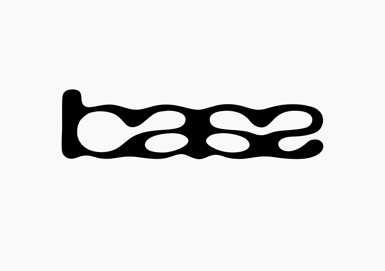
everything is built on one word, drawn as a single liquid mark — letters poured into one another.
a creative agency with no mark
base was already producing work for brands and artists — but had nothing to sign it with. an agency selling creative direction is judged on its own first.
the mark had to hold up everywhere: a feed avatar, a printed certificate, a founder's card. small, large, black on white, white on black.

a lot of routes,
one word
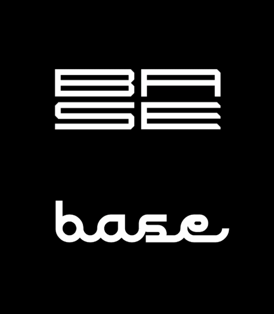
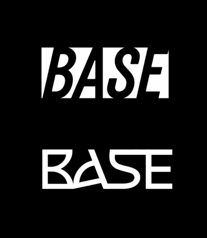
a lot of directions were drawn before one held: rigid boxed grotesque, stencil, techno-modular, psychedelic, sliced. each said something true, none said it all.
the answer was the loosest of them — letters melting into one continuous flow, softer than type. the rigid ones promised precision, and base doesn't sell precision. it sells ideas.
a logo for a creative agency shouldn't look assembled — it should look poured, like the shape found itself.


black & white, nothing else
colour was dropped on purpose: base frames other people's work, and a brand colour of its own would fight every frame next to it. the wordmark holds in pure black and white.
applied across a gift certificate («creative content, limitless potential») and the founder's business card — services and contacts on one black surface the team actually hands out.


got a brand that gets lost? let's pull it together.
© 2026. artem kovalskyi. all right reserved