a faculty worth choosing.
feu now looks its age — one brand across every touchpoint, and a team that can run it without redesigning anything.

loud on every surface
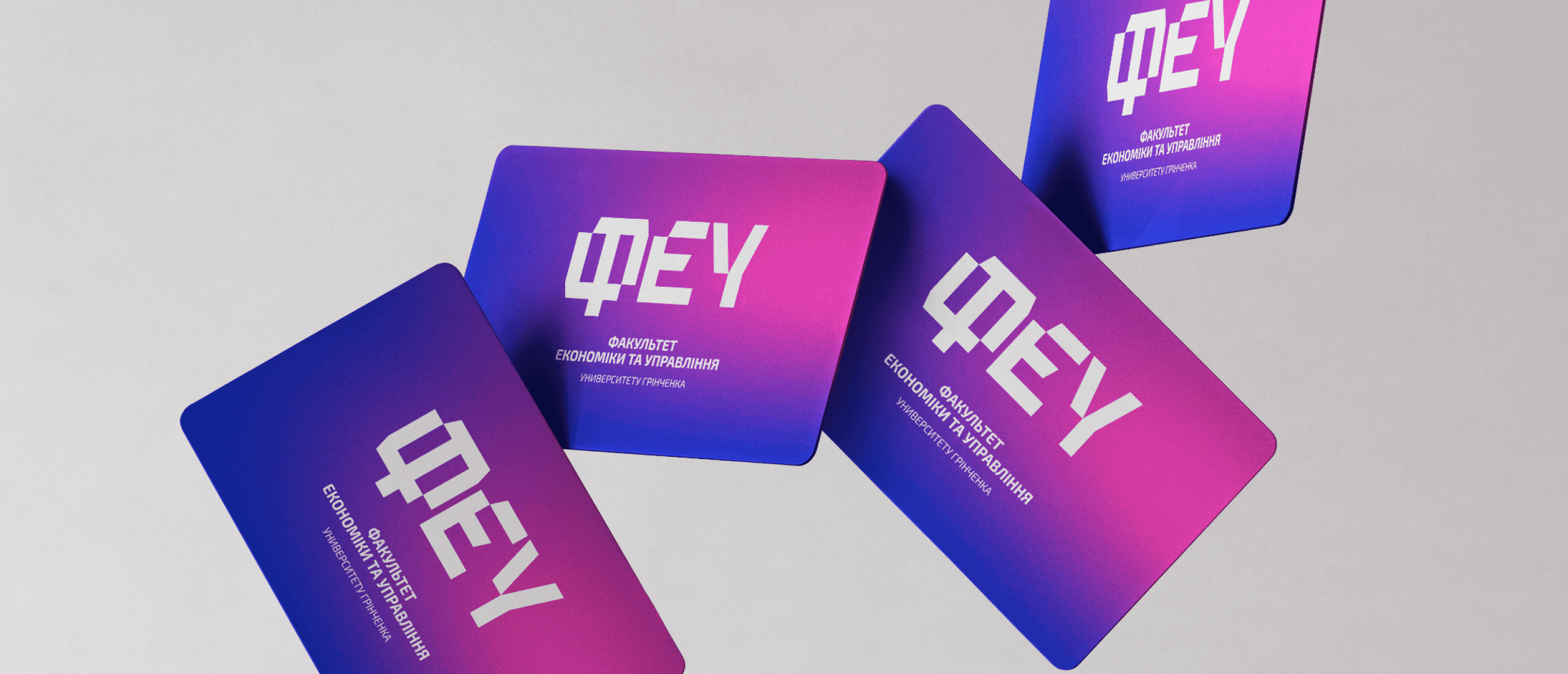
deep blue to pink gradients carry the brand across everything — merch, stickers, business cards, print and digital. bright enough to be noticed by a seventeen-year-old, disciplined enough for a university.
delivered as a full guideline book, so the faculty keeps the look consistent without me in the room.


a look that
aged out
a faculty inside a university has a hard brief: stand out enough to be chosen, stay close enough to belong. what feu had was dated, inconsistent, and easy to walk past.
and the people it's speaking to are seventeen. a brand that reads as official paperwork doesn't win an applicant deciding where to spend four years.

rebranding a faculty of borys grinchenko kyiv university
services
brand identity, guidelines, social media, merch
industry
education
location
Kyiv, Ukraine
description
feu is the faculty of economics and management at grinchenko university. its old look was dated and said nothing to the people it needed most — applicants.
the new one is loud, sharp and built for the generation choosing where to study.

built from structure, not decoration
monospace, because an economics faculty runs on structure — so the letters are built on a grid instead of drawn as an emblem.
two versions, because the full lockup dies at small sizes — the descriptor for official things, the bare abbreviation for everything else.
blue keeps it a university, pink is the part applicants answer to. one colour alone would only have said half of it.


got a brand that gets lost? let's pull it together.
© 2026. artem kovalskyi. all right reserved
menu