the brand shipped first.
skilliby had an identity before it had scale. the store page, the pitch decks and the first employer conversations all needed something to stand on.

two audiences,
one mark
the platform sells for two people at once: the candidate spending evenings on tasks, and the company paying for the shortlist. one needs to keep going, the other needs proof.
go playful and employers stop taking it seriously. go corporate and nobody finishes the first task. the identity had to land exactly between those two.


nobody in the picture
hr brands reach for people — handshakes, someone waving you into your future. i left all of it out. the moment you put a face on it, part of the audience stops seeing themselves in it.
an abstract mark stays open. the platform's entire argument is that background doesn't decide anything — so the brand has no business picking an age, a gender or a dress code on its behalf.

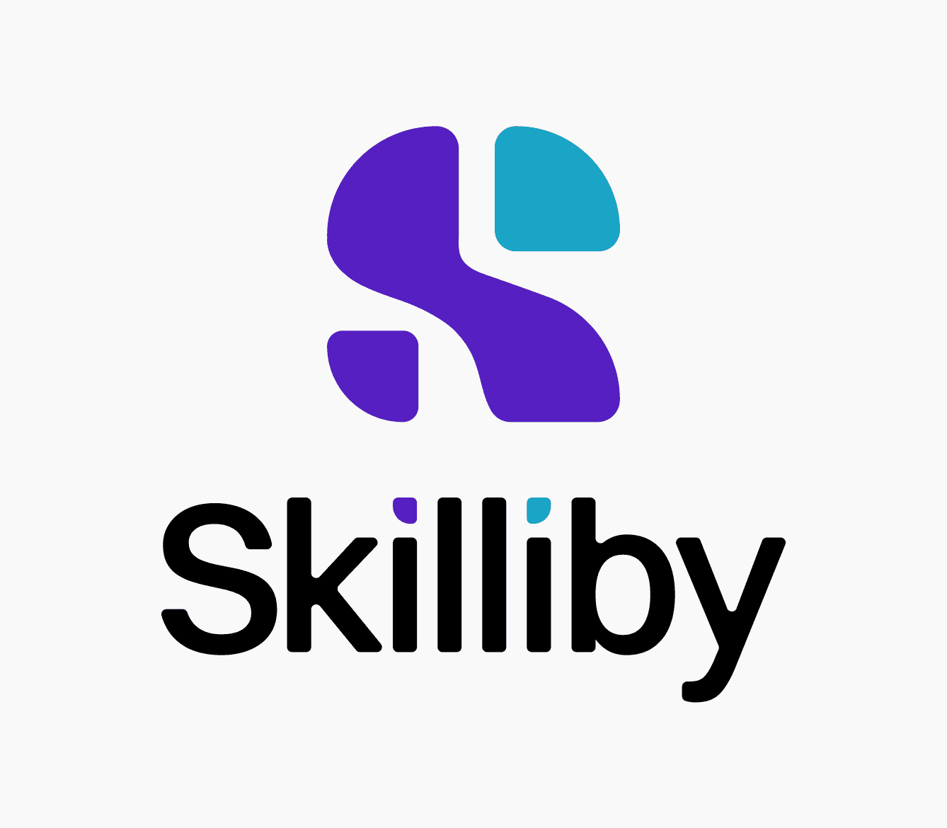
brand identity for a skills assessment and development app
services
logotype, app icon, visual system, brandbook
industry
edtech, professional development
location
contacts
Vancouver, Canada
description
Skilliby is a platform that turns short practical sessions into a measurable skill profile, helping users see their current level, strengths, growth gaps, and progress. available on iOS and Android.
the mark is built from parts locking together, the way a skill profile is earned: piece by piece.

assembled,
like a skill set
eight routes went up on the wall — loops, hexes, brushed letters. the one that stuck builds the «s» out of separate pieces, which is the product in one shape: you pass tasks, the pieces add up.
i kept the pieces geometric. the tasks feel like a game, but the outcome is someone's job — so it had to be round enough to feel human, straight enough to be believed.
the split is cut into the shape, not painted on — so it holds in flat white too. cyan just turns the seam up.


got a brand that gets lost? let's pull it together.
© 2026. artem kovalskyi. all right reserved
menu