sixteen pages, nothing lost.
the same range on a quarter of the paper — cheaper to print, lighter on the planet, and easier to read than the version four times its size.

product catalogue for an eco packaging manufacturer
services
editorial design, illustration, layout, pre-press
industry
manufacturing, food packaging
location
Kyiv, Ukraine
description
studiopack makes food packaging from aluminium and cardboard. i had already designed their full catalogue — sixty pages covering hundreds of items.
then came the harder brief: the same range, in sixteen pages.

sixty pages is expensive
paper is the real cost here. sixty pages against sixteen, multiplied by a run in the thousands, is a different budget line entirely — and it comes back with every reprint.
it also sits badly with the product. a company selling recyclable packaging shouldn't hand out a brick of paper — but not one position could be dropped to make it thinner.
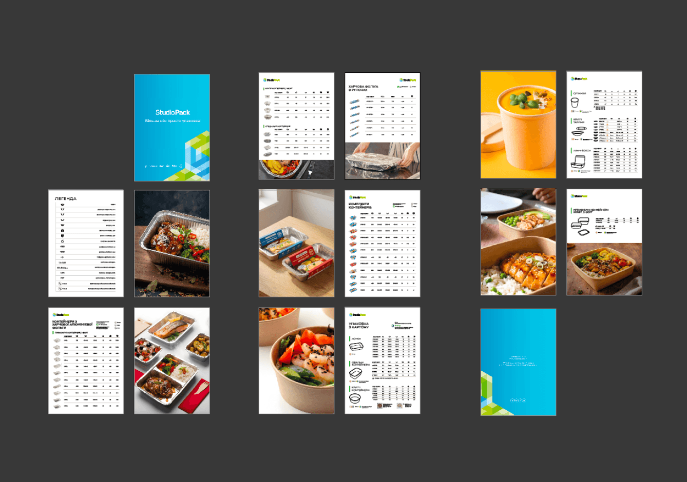

cut the repetition,
not the range
i went looking for what repeats. column labels written out as words, running down hundreds of rows, were taking more room than the numbers they described.
so the words moved into one legend at the front — an icon per parameter, learned once. after that every table reads without a single label repeated.
the range stayed whole. what shrank was the wording wrapped around it.

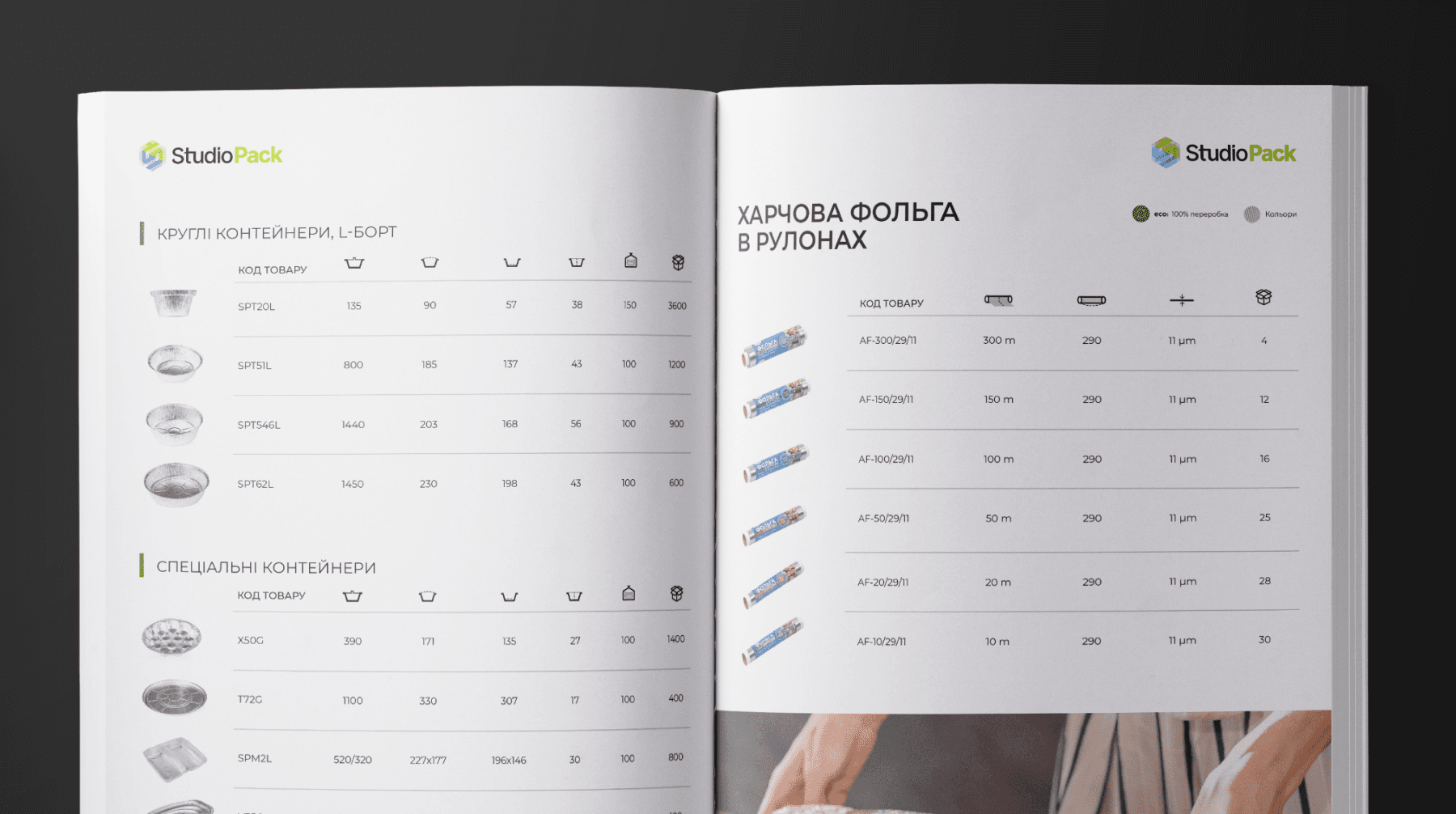
fewer pages,
more air
the odd part: at a quarter of the length, it breathes more than the original. compression came from deleting repetition, not squeezing — so the space that opened went back into margins.
grouping does the rest — products in blocks by type, each under its own heading. hand-drawn outlines carry the shapes where photos of near-identical trays would blur.


got a brand that gets lost? let's pull it together.
© 2026. artem kovalskyi. all right reserved
menu